Askora—When the Problem Is Complexity Itself
A self-initiated product sprint exploring how conversational AI can make marketing intelligence genuinely accessible — from first principles through to high-fidelity iPad prototype and live usability testing.
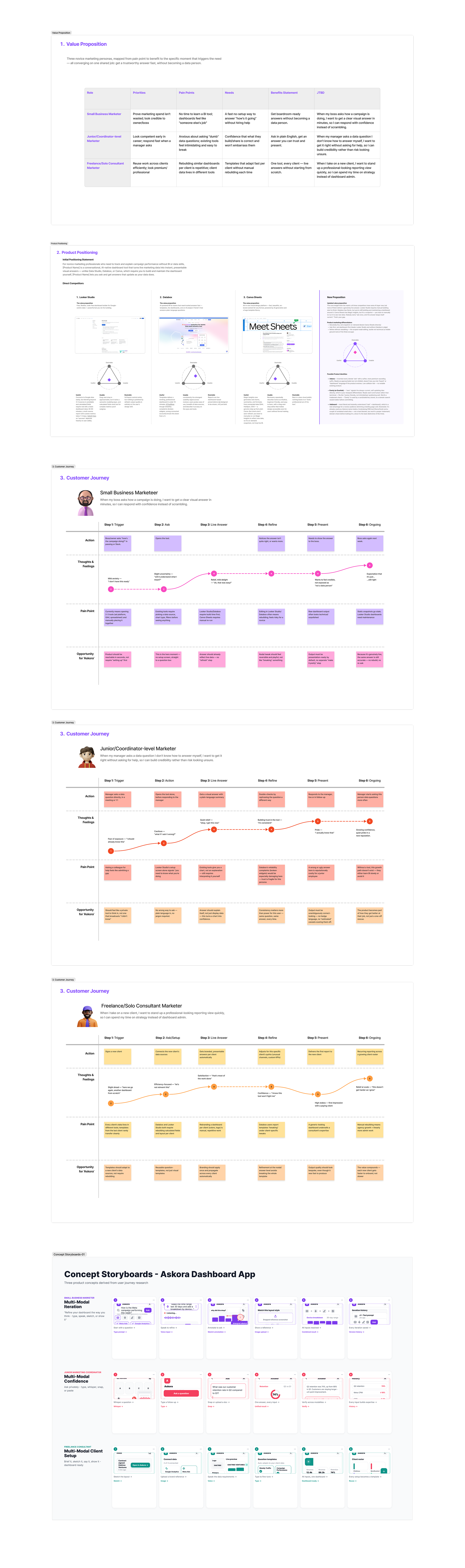
The sprint began with structured strategy work before a single screen was sketched. A value proposition matrix mapped the problem across three distinct user types — the Small Business Marketer, the Junior Coordinator, and the Freelance Consultant — each with different levels of confidence, different pain points, and different reasons to adopt or abandon a new tool. Competitive positioning analysis and individual customer journey maps followed, alongside concept storyboards to stress-test the interaction model before committing to high-fidelity design.
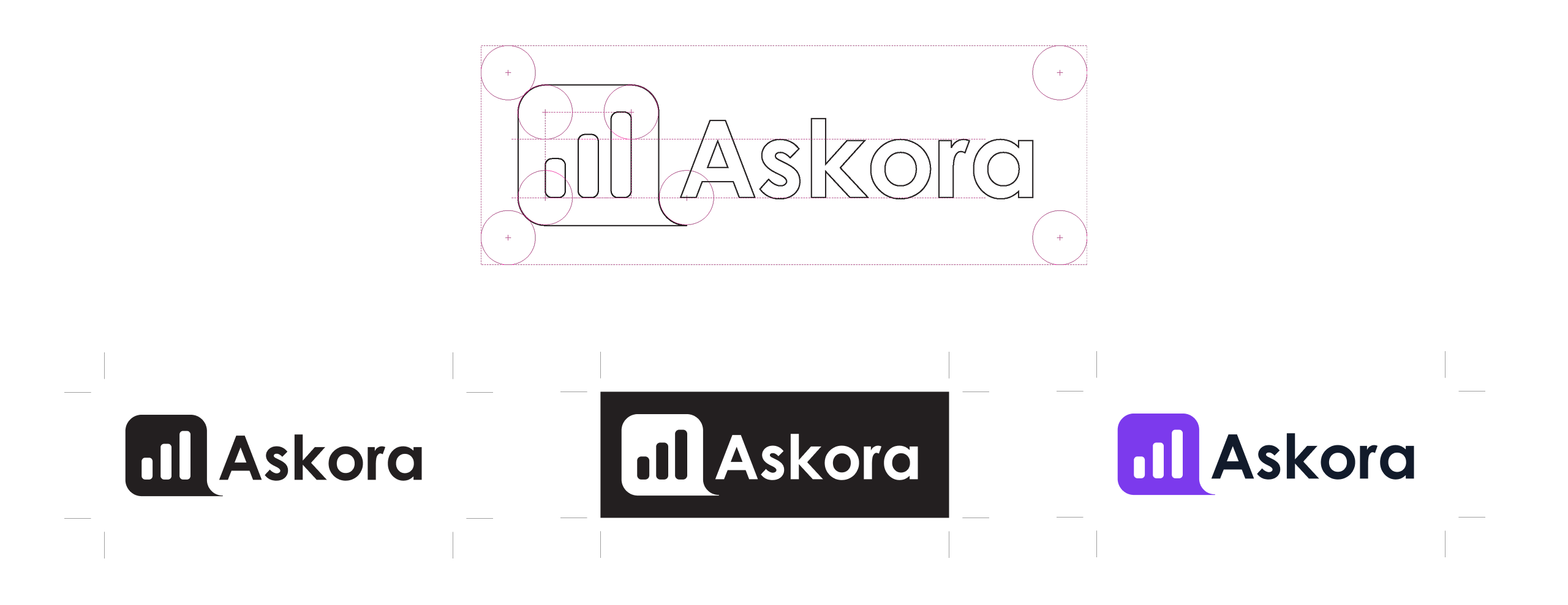
Brand identity was built from first principles. The Askora mark uses a geometric construction grid to combine a bar chart icon with a speech bubble form — signalling both analytics and conversation in a single lockup. Three colour variants were developed to ensure the mark works across light, dark, and accent-colour contexts, giving the product the flexibility to feel at home in a marketing dashboard, a white-label integration, or a standalone app.
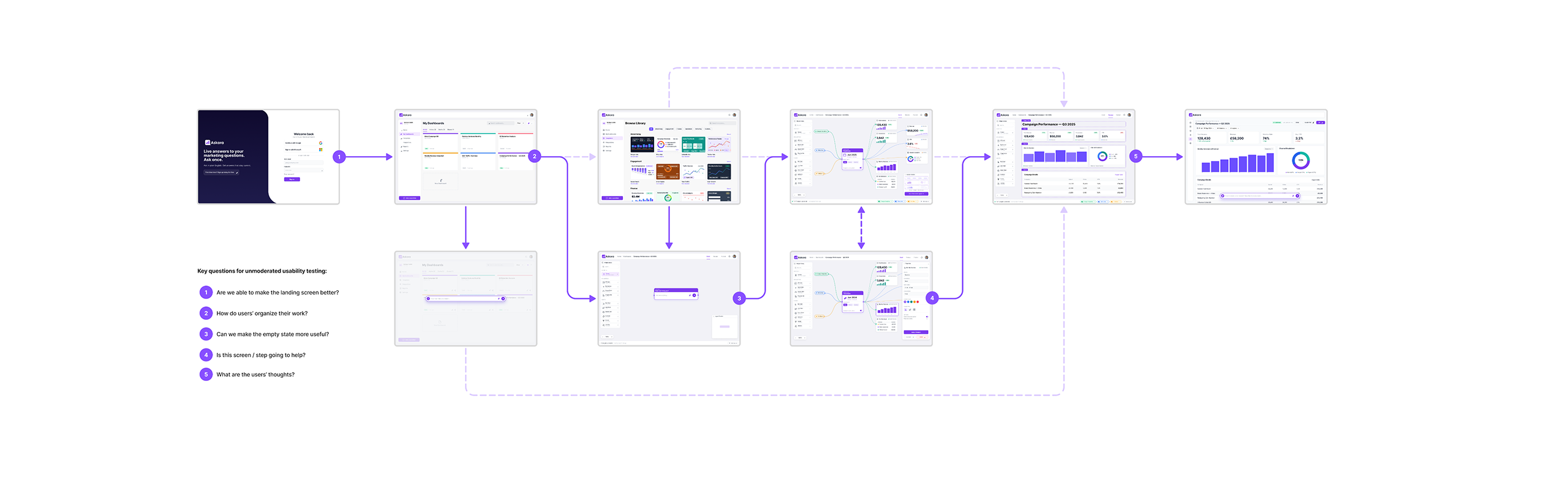
The full user journey was mapped as a structured prototype flow before testing — five numbered stages from first login through to a fully configured and published dashboard. Running alongside the flow, five unmoderated usability test questions were defined to validate each stage: whether the landing screen communicates the product clearly, how users naturally organise their work, whether empty states guide or confuse, whether each step adds value, and what users are thinking as they move through the experience.
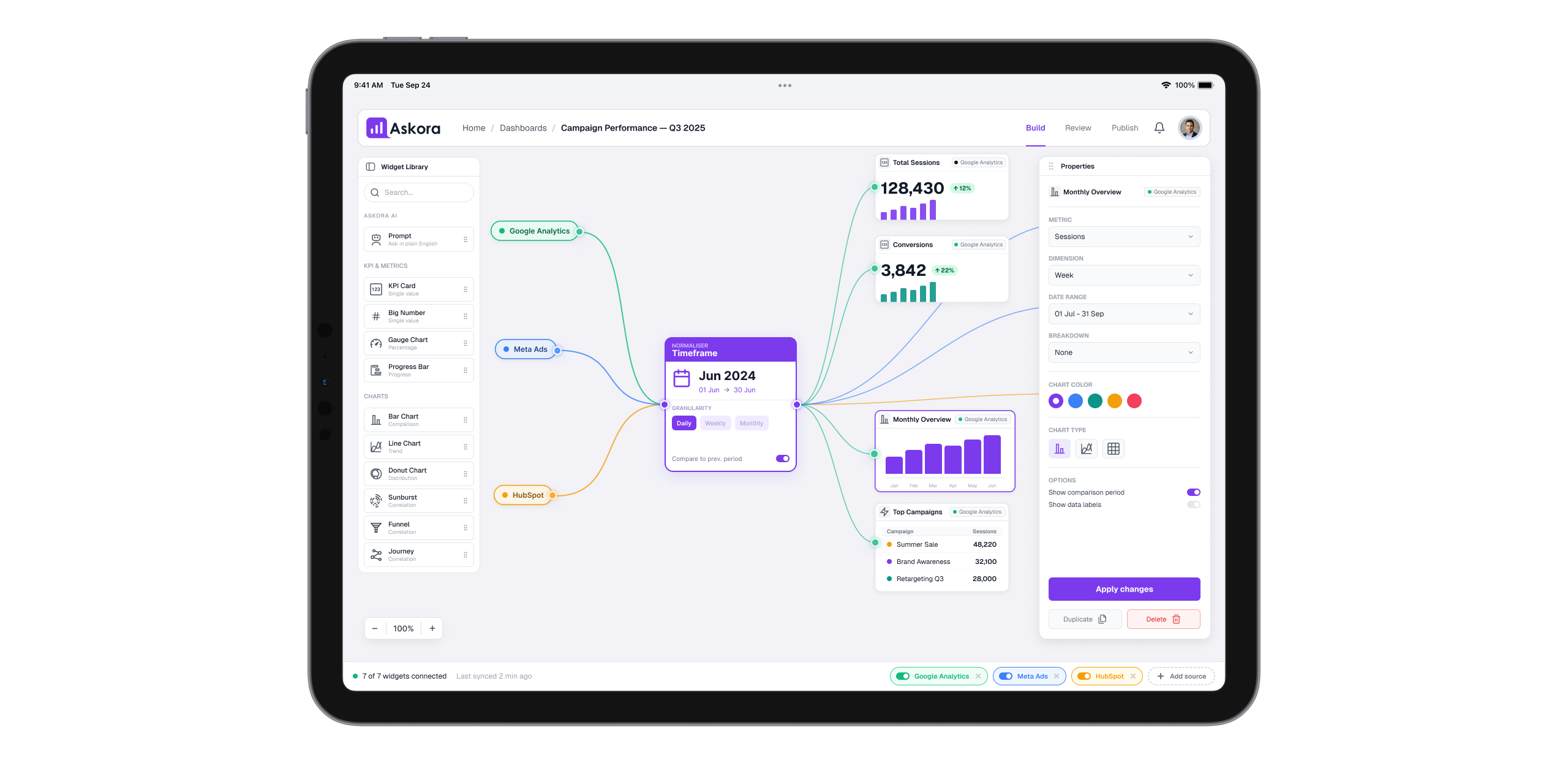
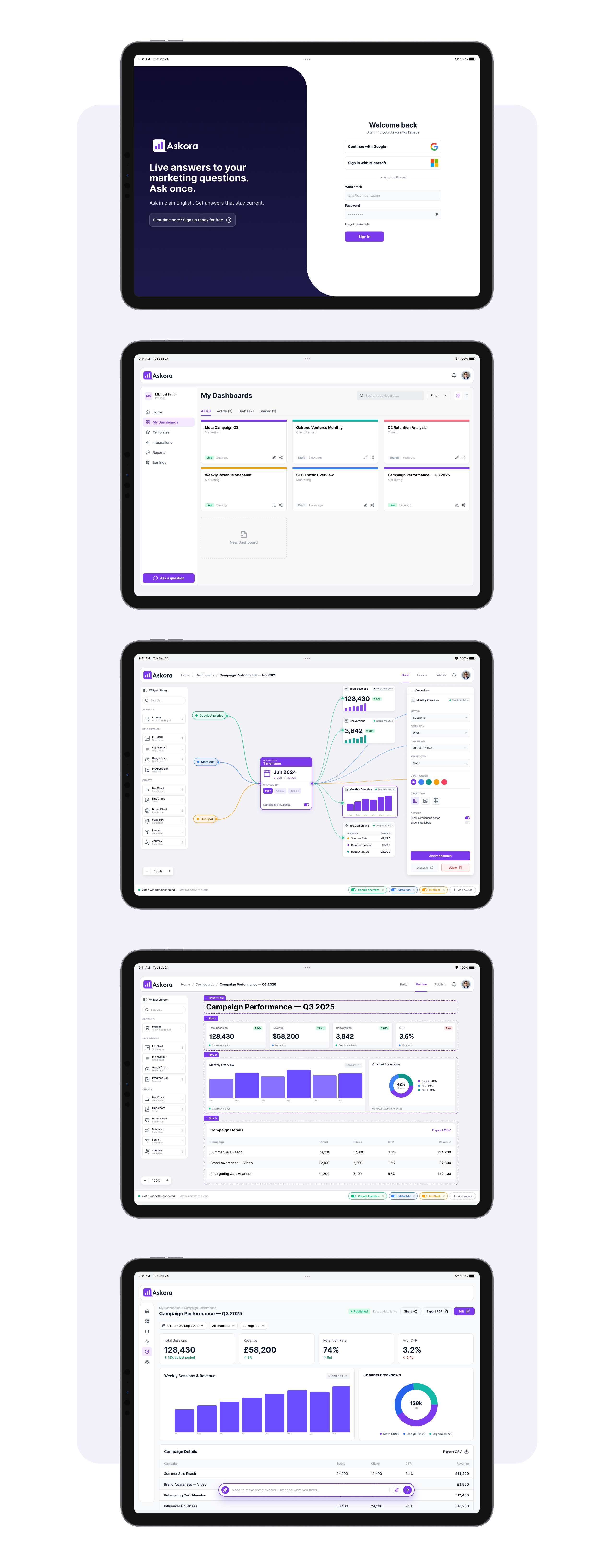
The high-fidelity UI covers the full product arc across five core iPad screens: onboarding and sign-in, the My Dashboards workspace, the canvas dashboard builder with its node-graph data connection system, the Campaign Performance review view with KPI cards and comparative charts, and the detailed analytics report. Throughout, a consistent dark sidebar navigation, data-forward content area, and Askora's purple accent colour signal interactive and AI-powered elements without overpowering the data itself.
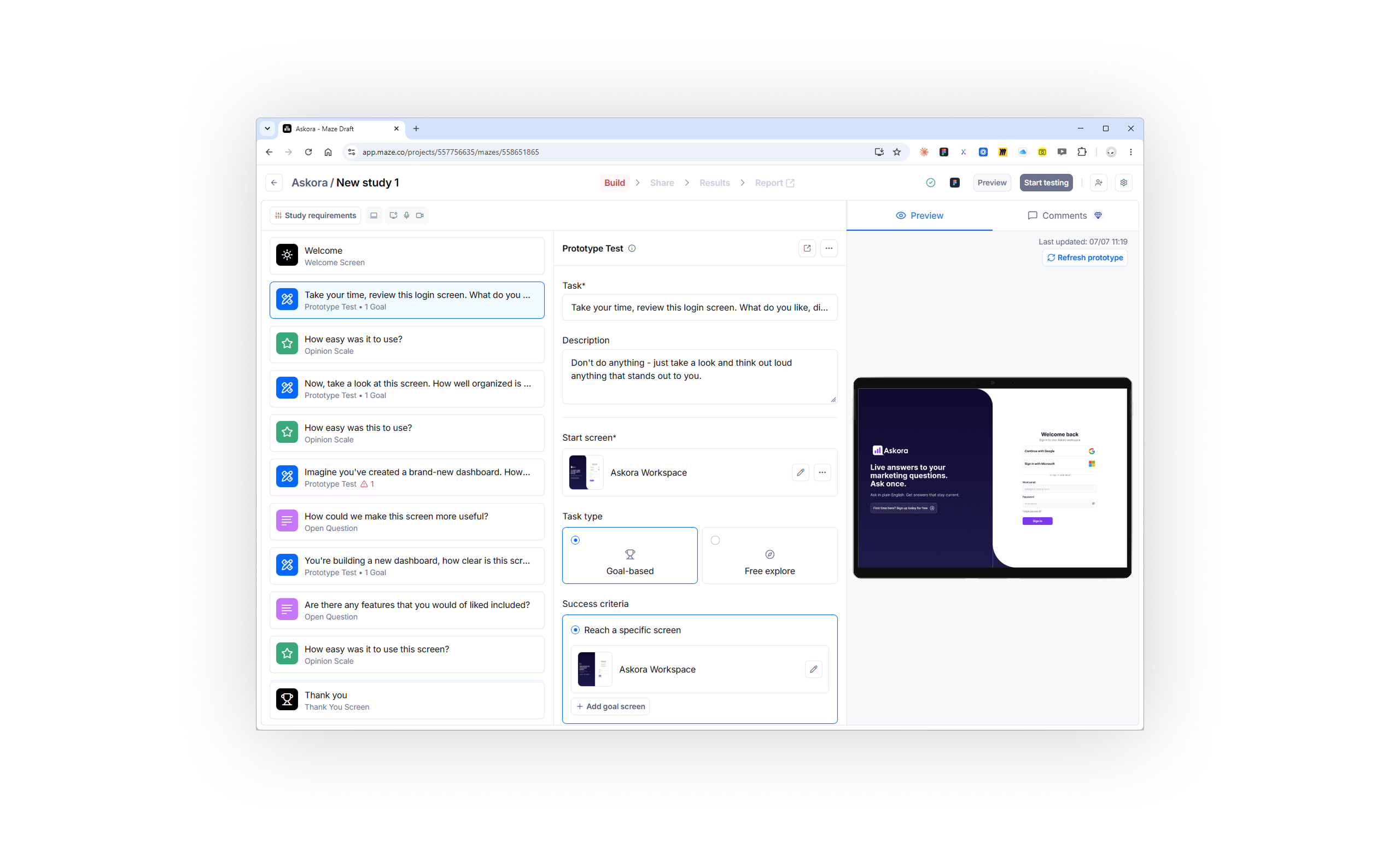
The prototype was taken directly into Maze for unmoderated usability testing. The study covers nine tasks — a structured mix of goal-based prototype tests, opinion scales, and open questions — designed to validate first impressions of the sign-in screen, clarity of the dashboard organisation model, ease of use at each step, and whether there are features users expected but didn't find. Success criteria are mapped to specific screens, giving the study objective pass/fail data alongside qualitative feedback.