Askora AI
A self-initiated sprint making marketing intelligence genuinely accessible — from first principles to a tested iPad prototype.
 3
3 5
5 4
4Marketing intelligence is locked behind fragmented tools and API complexity, out of reach for the people who need it most. I framed it around three user types with one shared goal: make multi-source data feel effortless.
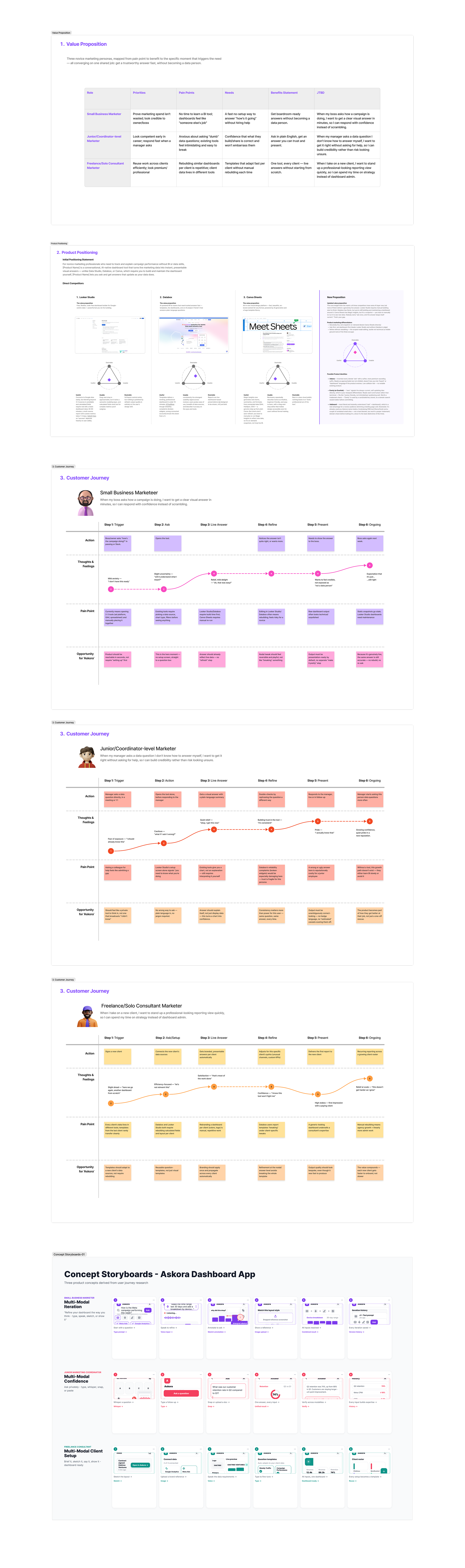
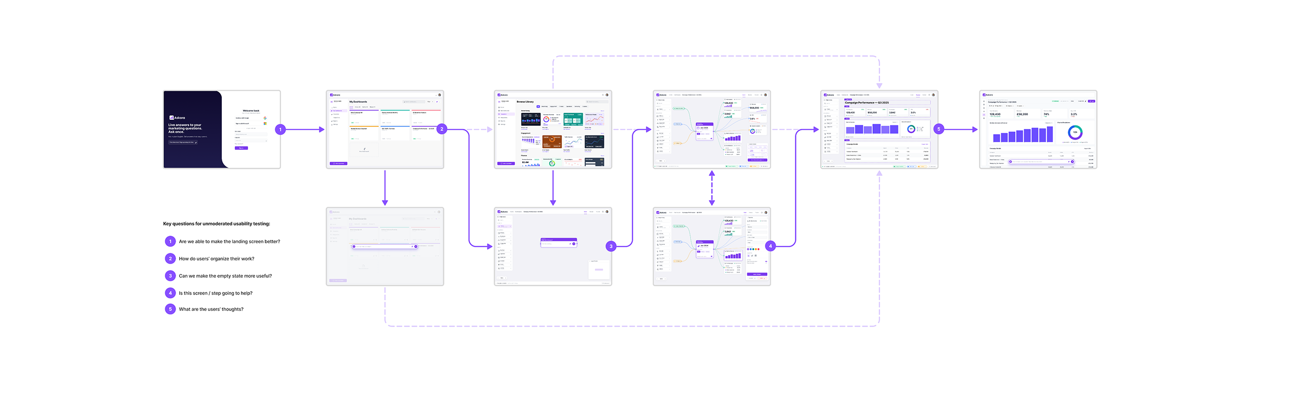
Strategy came before any screen — a value-proposition matrix, competitive positioning, journeys and storyboards tested the model first. The journey from first login to published dashboard was mapped in five stages, each with a usability question.
With the direction set, design moved fast — three strands into one product.
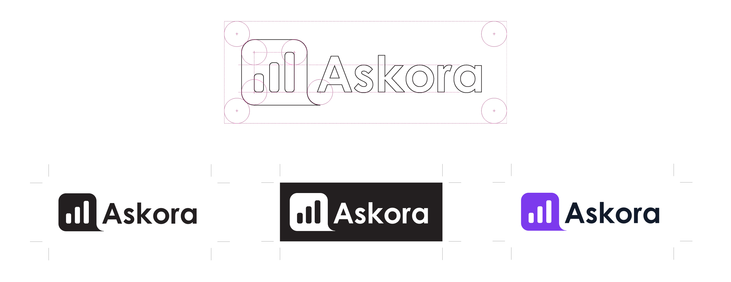
The Askora mark fuses a bar-chart icon with a speech bubble — analytics and conversation in one form — in three variants for light, dark and accent contexts.
Designed AI-native throughout — Figma MCP and Claude Design in parallel, prototyping and refining in real time. The session history captures it: prompt, review, refine, repeat.
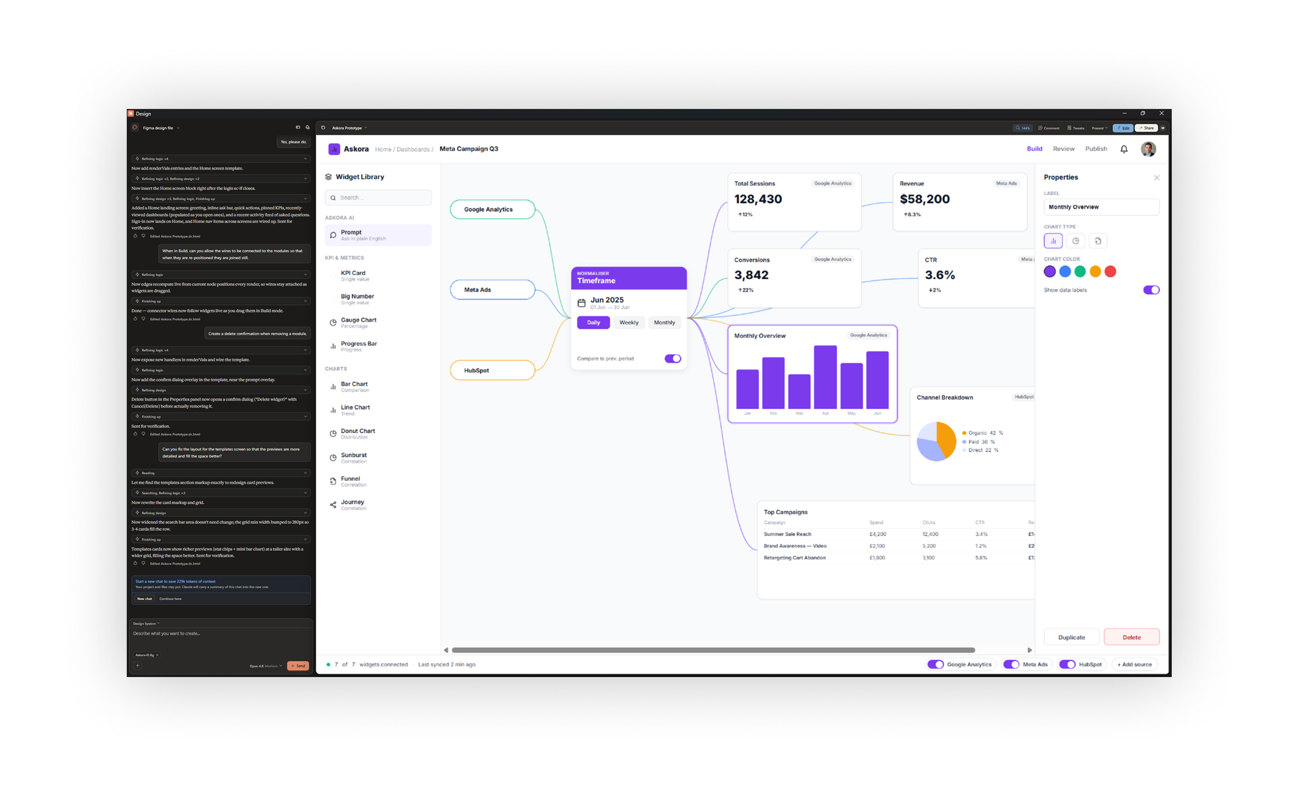
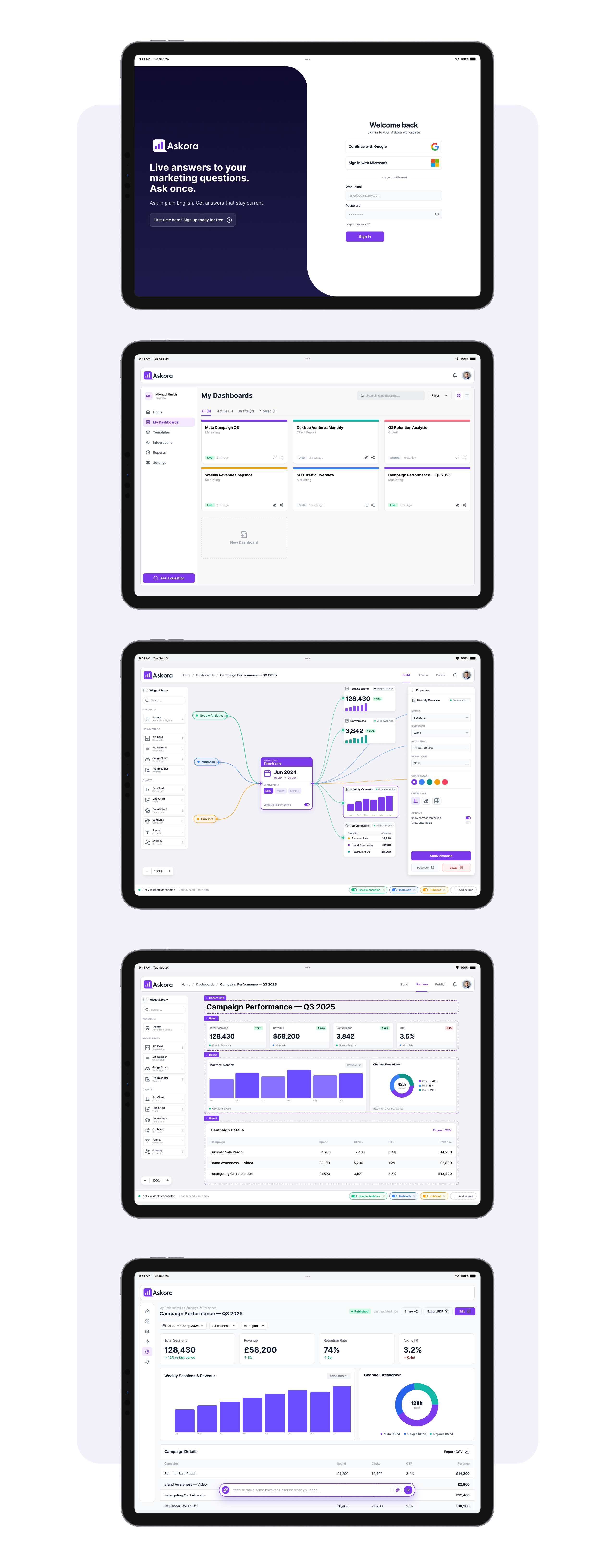
Five core iPad screens span sign-in to published report. The canvas builder wires Google Analytics, Meta Ads and HubSpot into a visual node graph — real-time data into widgets, no API logic required.
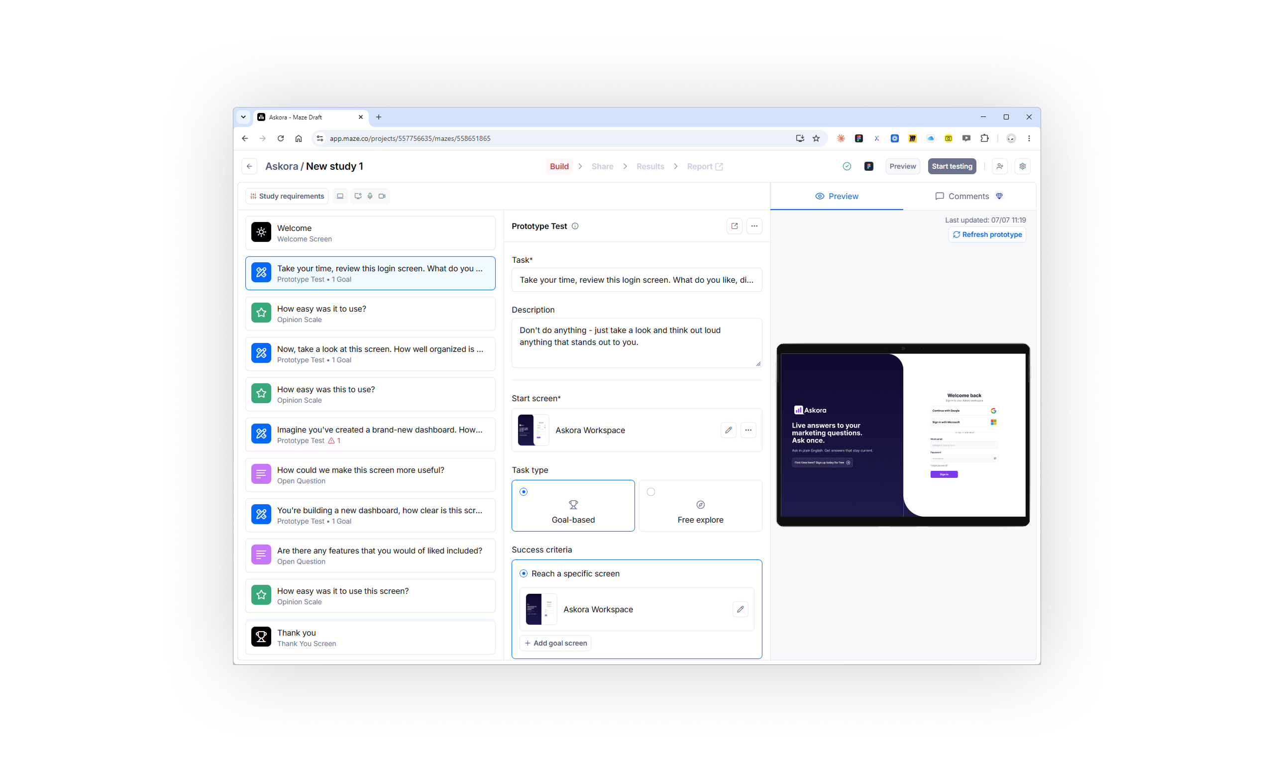
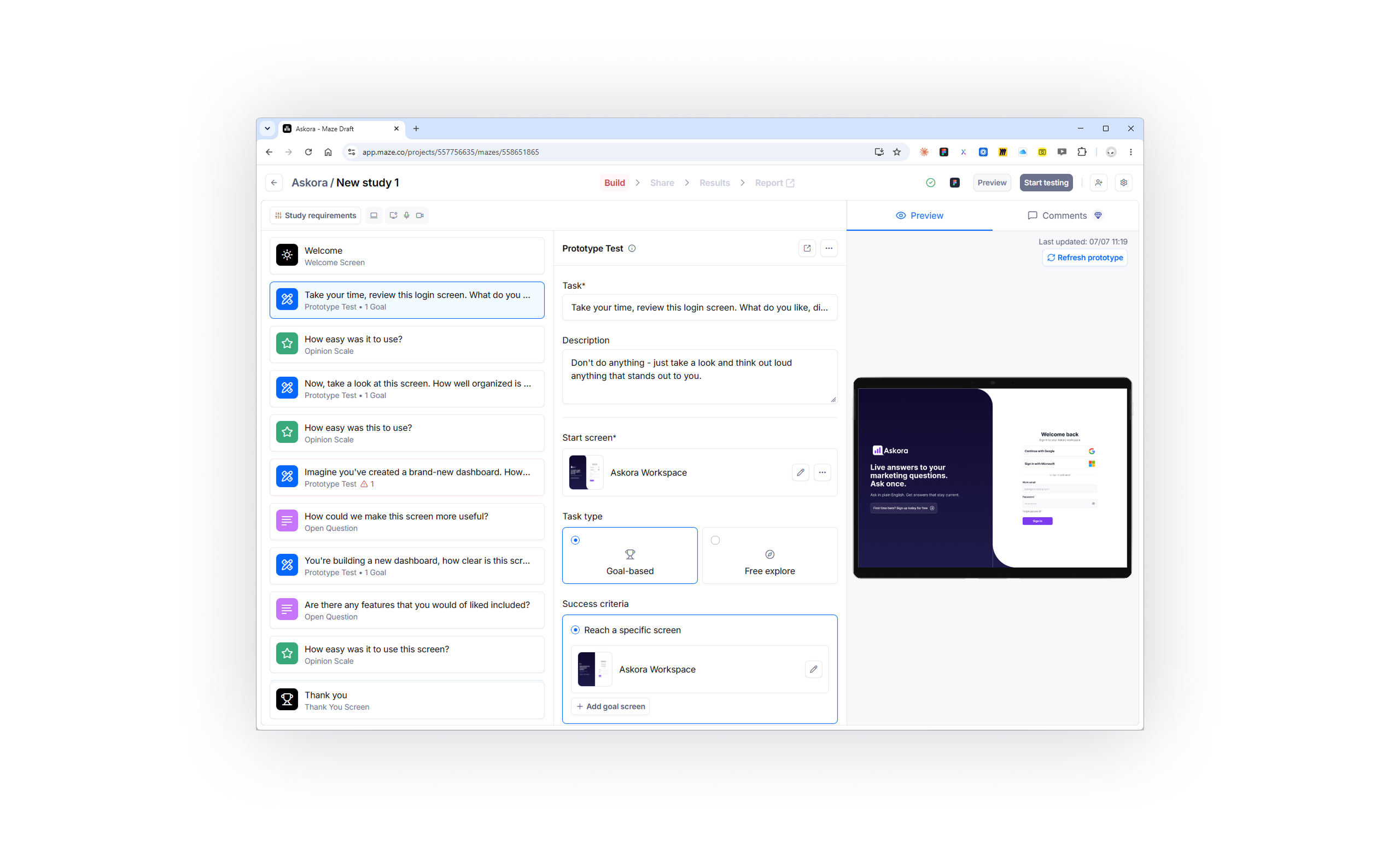
Straight into Maze — nine unmoderated tasks against the five Define questions. The result: a complete end-to-end concept, problem to tested prototype, in four days, with Claude and Figma AI compressing the whole workflow.