Every screen above is a snapshot. The live build lets you rotate the globe, scrub thirty days of history and model exposure for any city, in real time.
Atlas
Reimagining how global risk is seen — seven intelligence domains gathered onto one replayable sphere, designed and prototyped for the iPad.
 7
7 20
20 30
30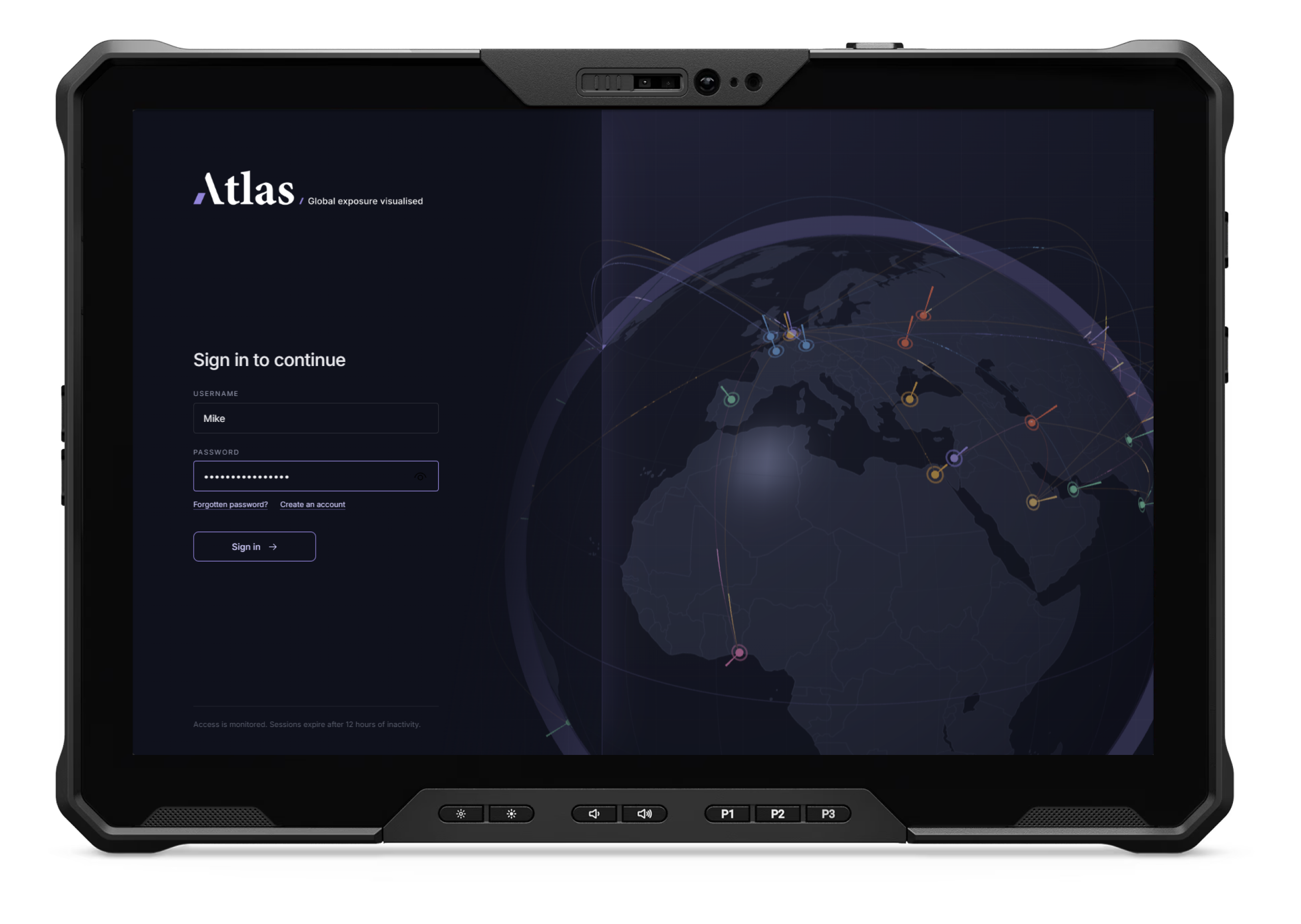
Global risk stopped keeping to its lane. A drought tightens a supply chain; the delay strands a shipment beside a port already fighting a ransomware claim. Wildfire smoke, a refugee camp, a breach alert lighting up a control room at 3am — each lives in its own dashboard, tracked by its own team. Nobody watches all of it at once. Atlas began with one question: what if every domain shared a single map?

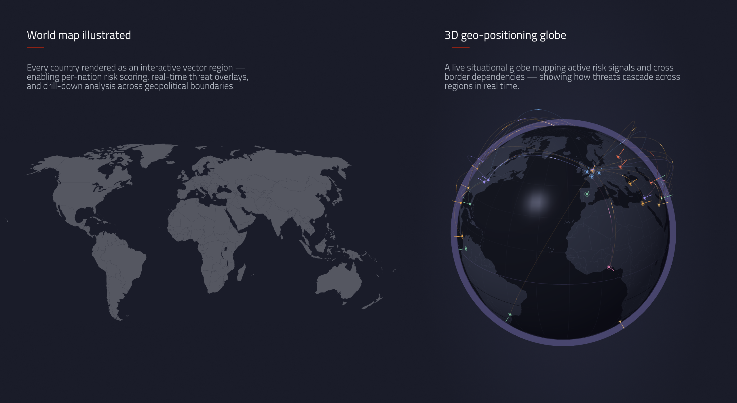
Before any interface, Atlas needed a coordinate system — every signal had to resolve to the same thing: a place on Earth. The first artefact wasn't a screen, it was a projection: a flat, interactive world map for per-country scoring, lifted onto a live 3D globe so a viewer could see how risk crosses borders, not just where it sits.
A quietly authoritative wordmark — a high-contrast serif steadied by a single leaning accent shape, built for light and dark contexts. The tagline states the promise plainly: Global exposure visualised.
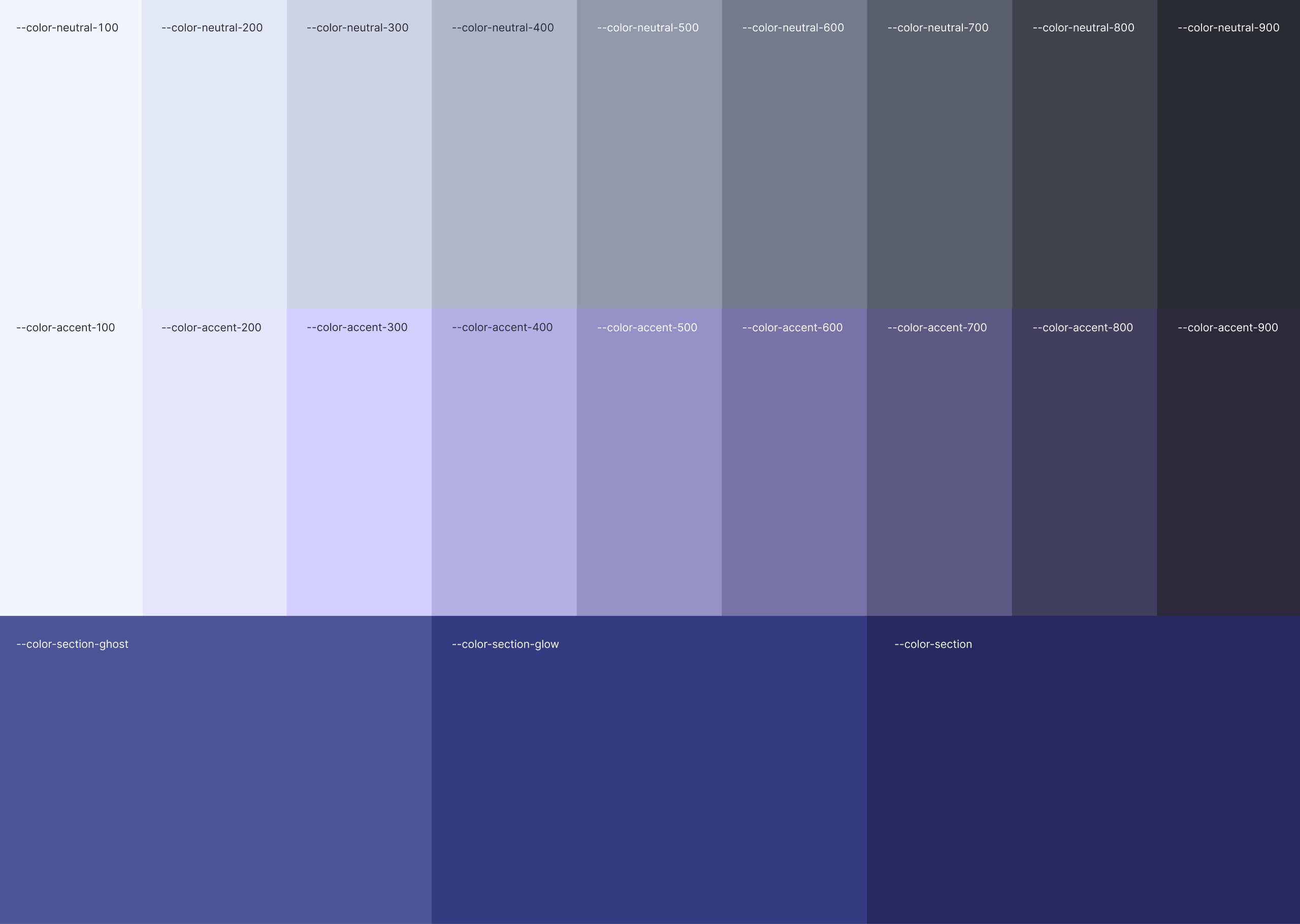
A tokenised palette does the heavy lifting — a deep neutral ramp, a violet accent for focus, dedicated tones for the ambient globe. A single 24-icon line set keeps every control legible against the dark canvas.

With the system set, the experience took shape screen by screen — a monitored entry point, a calm first-run orientation, then the globe comes alive.
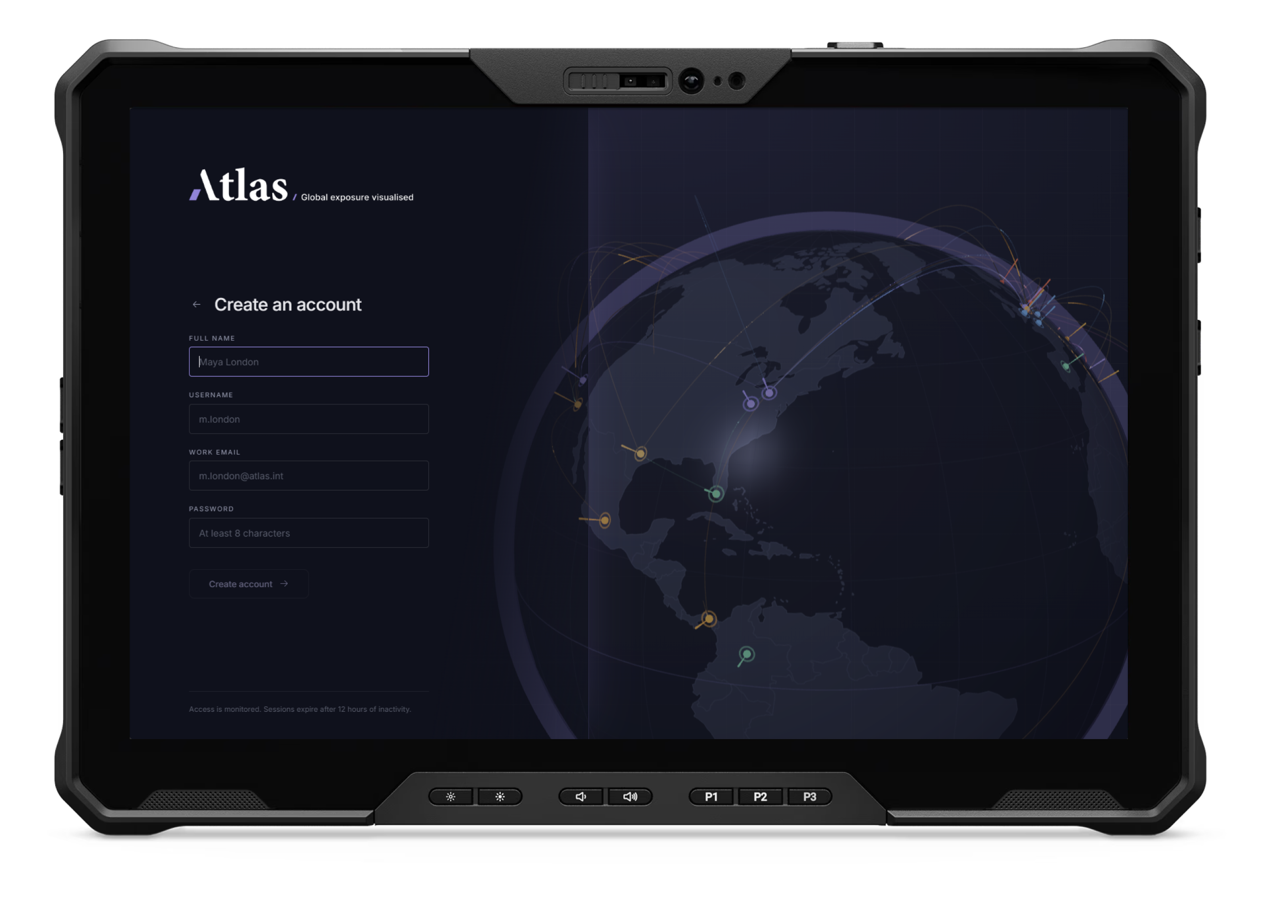
The sign-in sets the tone before a word is read — a slowly rotating globe behind a focused form, signalling what waits inside is serious, live and monitored.
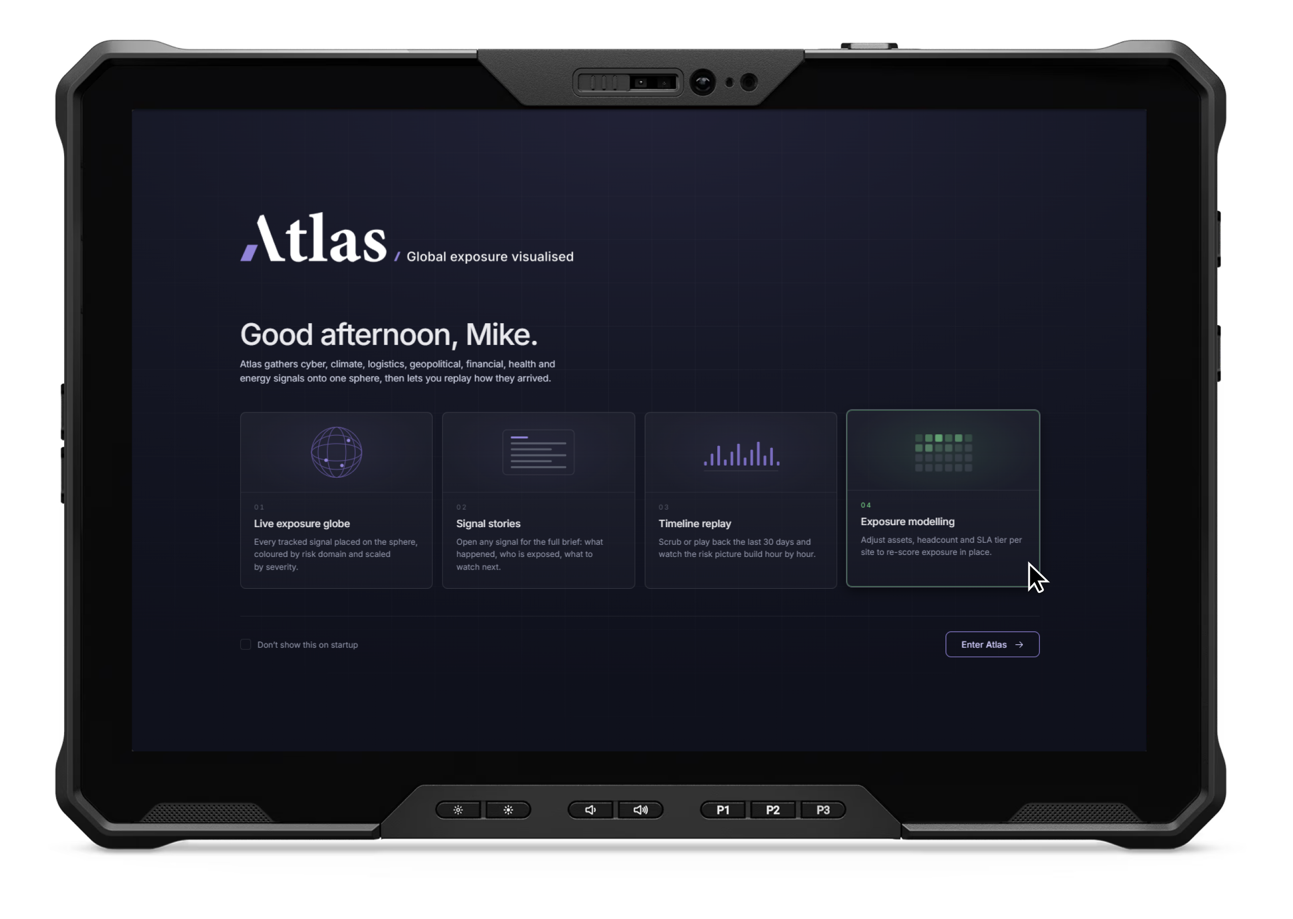
A personalised first run frames the four ways in — live globe, signal stories, timeline replay, exposure modelling — so a new user knows what the product does before it opens.
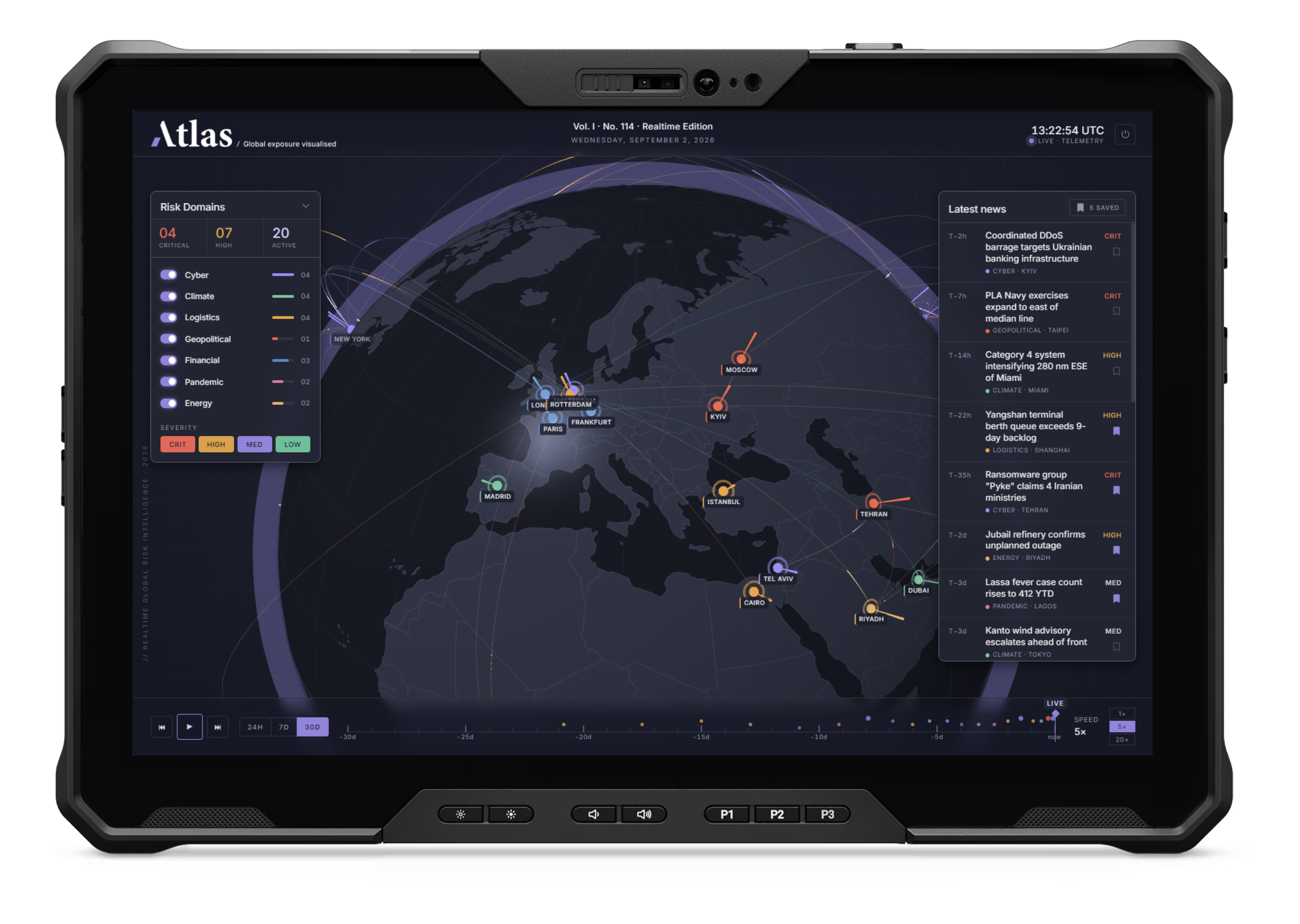
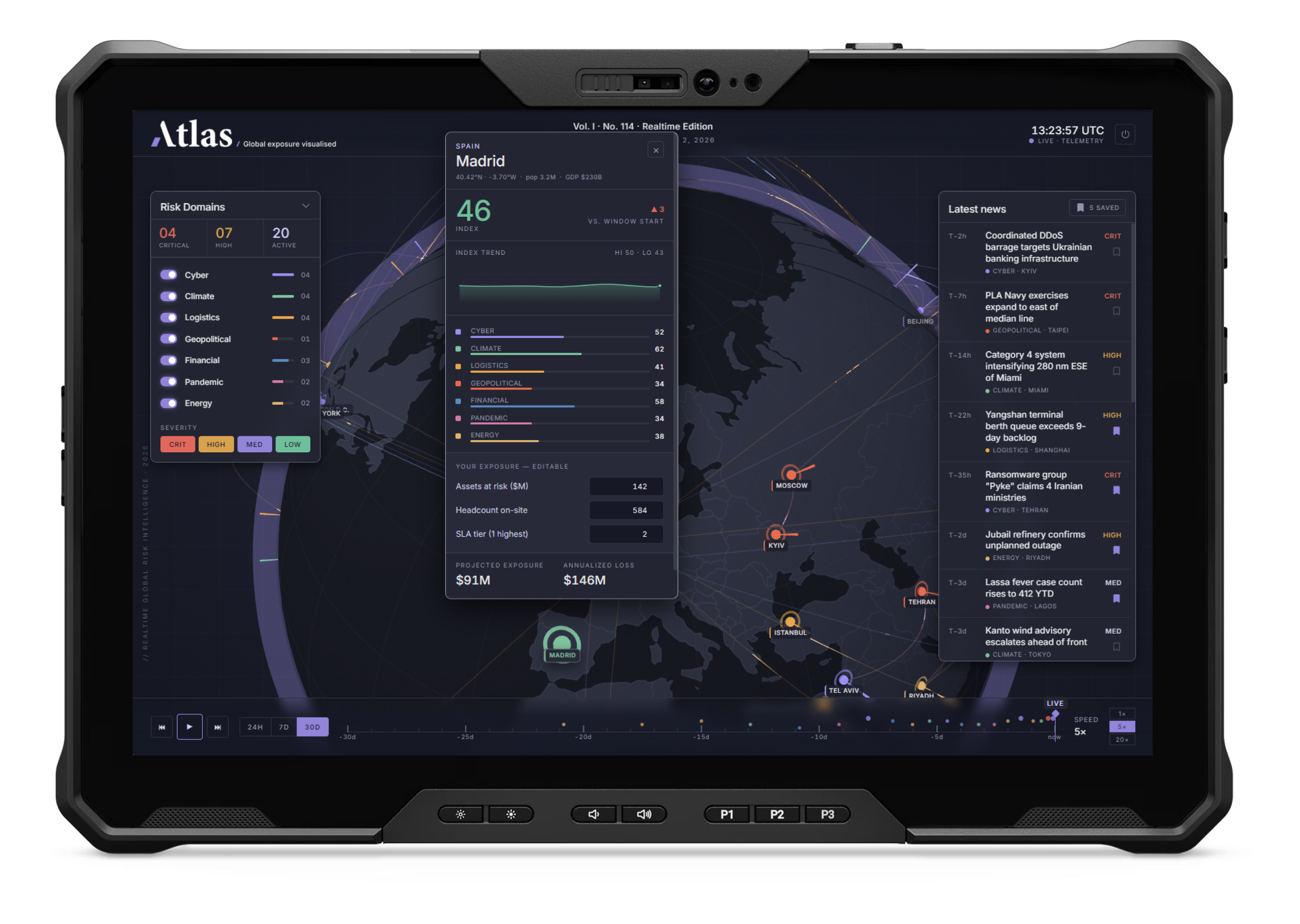
Verticals toggle on the left, the signal log streams on the right, a timeline scrubber runs it forward and back. Rotate west from Europe and the same system holds — Washington, Miami, the Atlantic corridor — proof it scales past one region.
A map that only shows is half a tool. Atlas lets you interrogate it — model your own exposure at any location, or open any signal for the full story behind the dot.
Tap a city and the risk index breaks down by vertical. Enter your assets, headcount and SLA tier, and Atlas re-scores projected exposure and annualised loss in place — a global view turned into a decision that's specific to you.
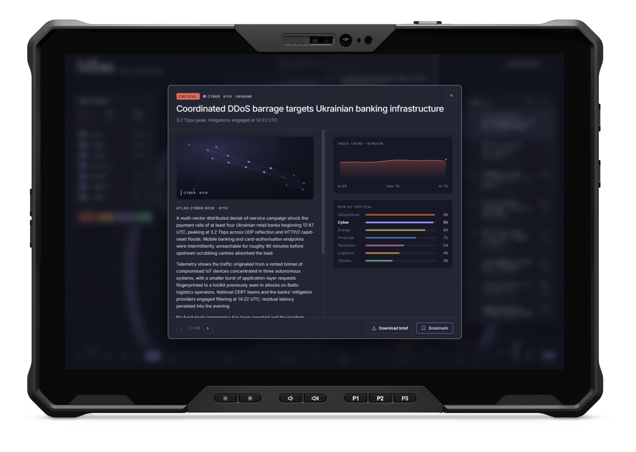
Every dot opens into a full brief — what happened, who's exposed, the index trend, the risk breakdown by vertical — written like a global newsroom. Bookmark it, download it, or move on.